This post will be dedicated to various 8Bit character designs. I will explain what I think about the design and how it is either effective or in-effective in my own opinion.
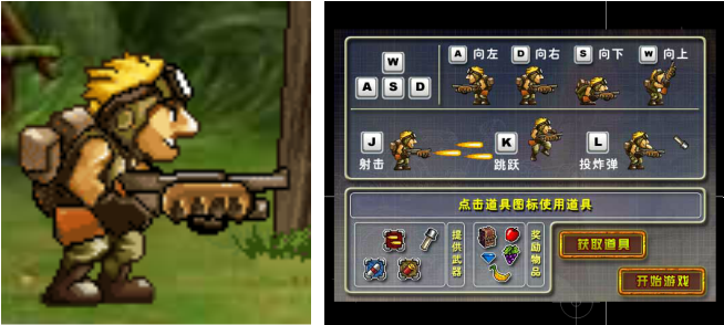
This is the main character design from the side-scrolling shooter Metal Slug. His design is very typical of that for a soldier, with the stereotypical army gear and the big gun. His design looks very good and very smooth but I fail to see any reason that design would be a memorable one. it is very generic for that of the 'hero' soldier and has nothing about him that really makes him unique.
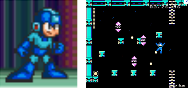
Seen here is the main character design for Mega Man, the main character from the globally popular Mega Man series of games. His design is very futuristic in order to match the futuristic setting of the game, although his iconic blue suit really makes him stand out. His levels were designed with difficulty in mind but would never throw a new obstacle in your way without warning and a chance to avoid and / or defuse the situation. This would be so that when you died in-game, it would make it feel like it was all your fault, not the games. The background design is plain in a way but simply oozes style and the solid backgrounds really made your character stand out.
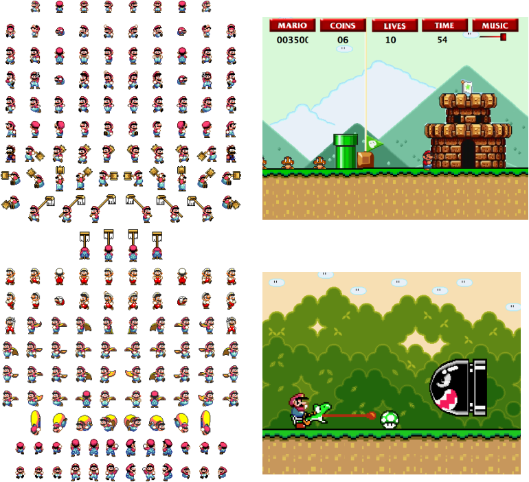
This is the main character design for Mario in the game Super Mario World. His design is easily one of if not the most recognisable from the world of gaming. His red overalls, iconic moustache and overall design are instantly recognisable. He isn't your average typical hero and he certainly isn't like anything else in the game industry. He is iconic and I would really like to have a design similar to this for my own character. The level designs are also very bright, colourful and iconic in order to match the characters design and the combination of the two is a true graphical masterpiece. Nothing is out of place.
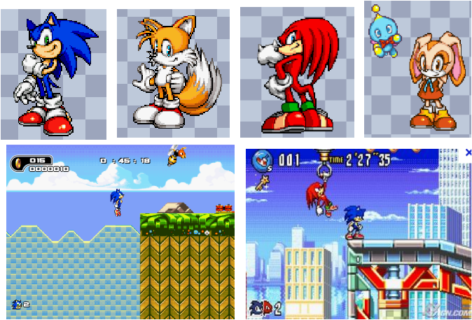
These are the sprite designs for the main characters of (from left to right) Sonic, Tails, Knuckles and Cream the rabbit from the Game Boy Advance games Sonic Advance 1, 2 and 3. Their designs, like Mario have become very iconic as they are unique to only this series of games. Sonic's design personifies speed making it look much more effective whilst his blue shading only adds to that. Each character also has a cute appeal while having a cooler edge, so these designs appeal to a large number of people. I really like these designs and the appeal of them, but I think I would like my character to be more simple and perhaps 8-bit instead of 16-bit.
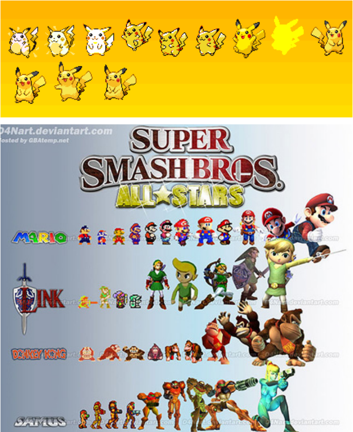
Here you can see the evolution of character design of several of Nintendo's biggest stars including (from top to bottom respectively) Pikachu, Mario, Link, Donkey Kong and Samus. As you can see, these characters started out as very basic sprites and have evolved to graphically into more detailed sprites and then into 3D models. Each character is still very recognisable from their original sprite and I wish to capture this element in my design. I want my character to be memorable whilst also maintaining a basic but intelligent design.
 RSS Feed